
Objective:
Zomato wanted to strengthen its visual presence in local markets by designing touchpoints that people see and use every day. The goal was to make sure the brand looked fresh, familiar, and easy to spot , whether in a customer’s hand or on the street.
What We Did
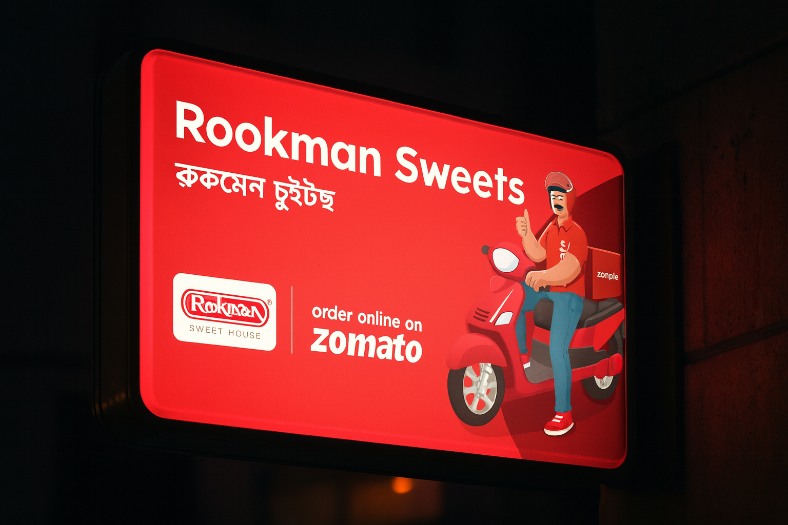
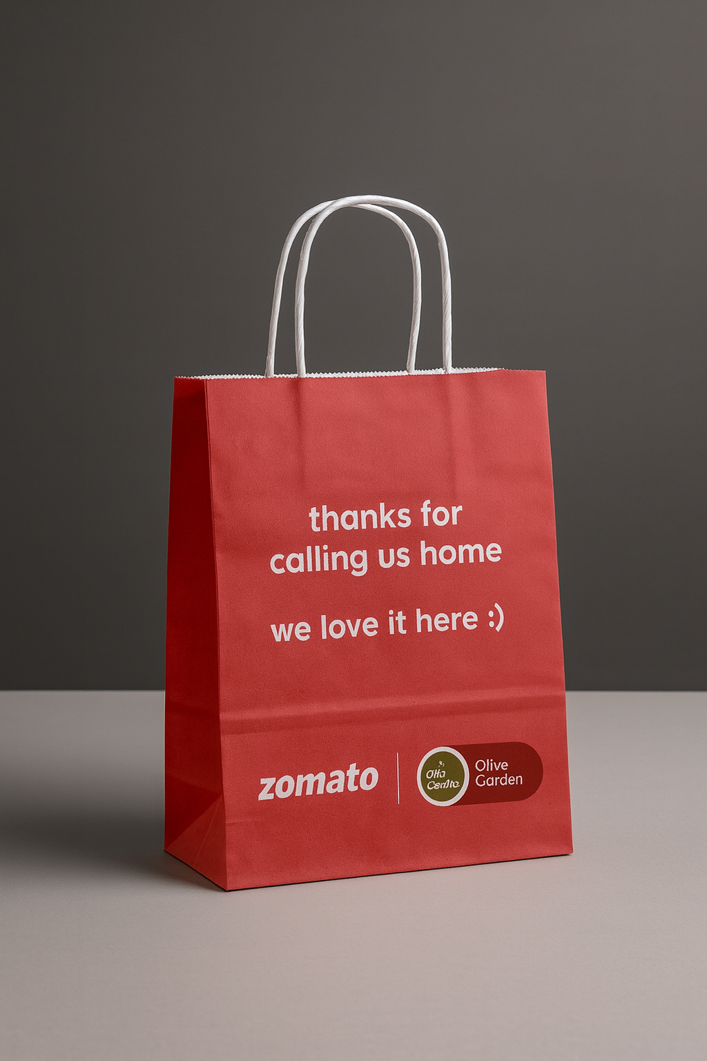
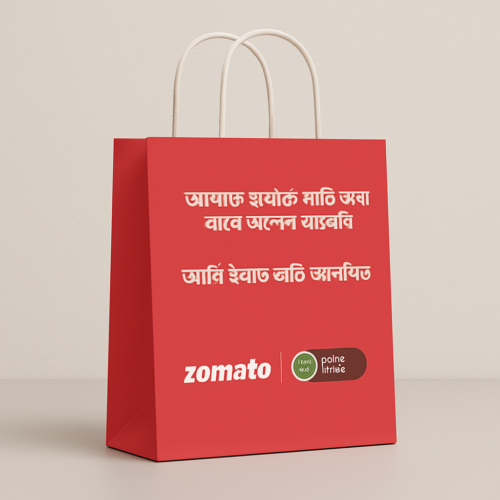
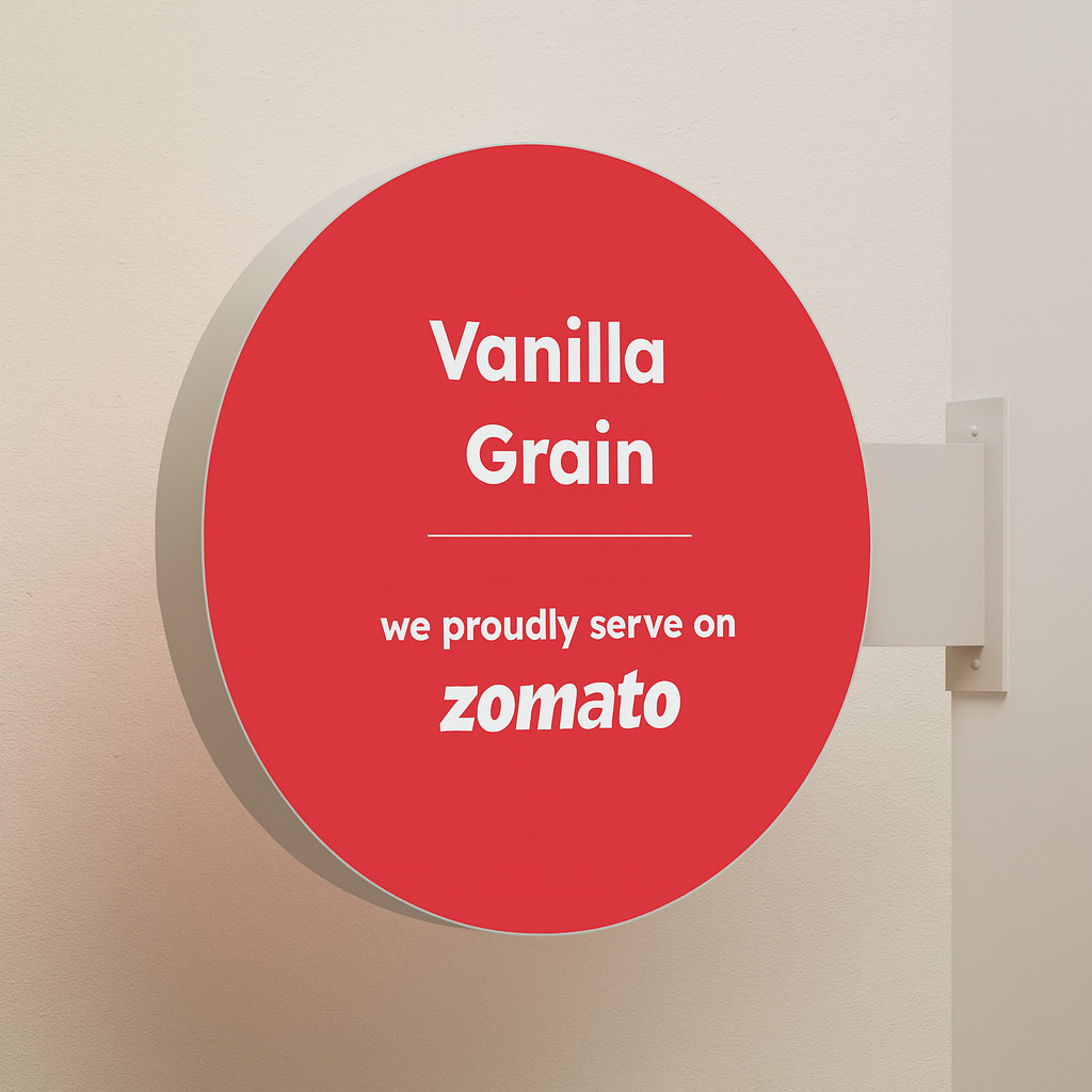
We created clean and catchy designs for Zomato’s paper bags used during deliveries. Each bag was designed to reflect the brand’s personality and connect with customers during the moment of order fulfillment. Alongside the packaging, we also designed bold and clear visuals for sign boards and flange boards to be placed across busy areas. All designs followed a unified look, with strong colors, easy text, and a fun tone that matched Zomato’s identity.
How It Came Together
People remember what they see often. By focusing on daily visibility through packaging and outdoor branding, Zomato stayed in the eyes and minds of its audience. It was not just about being seen. It was about being remembered.
Impact:
• Stronger brand presence in offline spaces
• Increased customer recall during and after deliveries
• Designs that supported both promotion and recognition
• Better visual identity in high footfall zones
• Seamless connection between online orders and offline presence
Outcome:
Through simple but powerful design, Zomato became more than an app on your phone. It became a brand you see, hold, and recognize every day. This campaign showed that great design does not just look good but drives visibility, trust, and lasting impact.